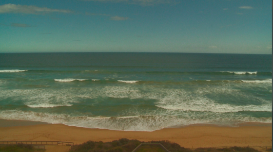
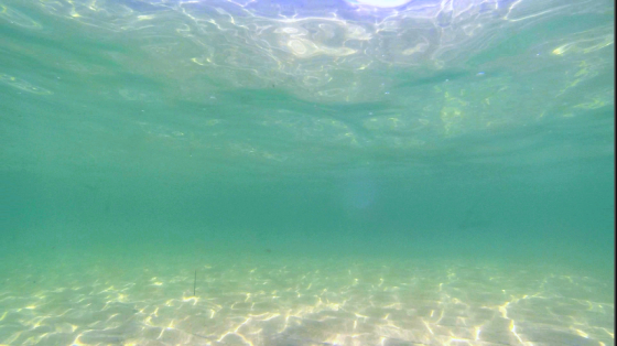
This weeks task required us to colour correct a number of shots from our documentaries. As I have never properly learnt how to colour correct, I was excited to watch a Lynda tutorial and start from the beginning. Overall I thought the task was fun, especially when I challenged myself to replicate a style I had already seen. Having a visual representation of what you are trying to achieve makes the task a lot easier!
This is how my experimenting turned out:
Original Image:
Version 1: I’ve highlighted the oranges and the greens to make an image that is more saturated in colour, and brighter to look at. This makes it appear sunnier, and makes the ocean more inviting in our film.
Version 2: Ive created a higher contrast again in the image, but have dulled the oranges and darkened the overall image. This gives a darker and more foreboding feel to the ocean.
Version 3: This image has been heavily saturated and lightened. Making the image very colourful and inviting, yet not very realistic.
Version 4/experimental: (excuse the wire frame) I wanted to try and emulate the imagery found in Dark Side of the Lens, and used a 4-colour gradient and a heap of contrast to do so.
A comparison to a shot from Dark Side of the Lens
The second shot was underwater, providing less to work with but was still enjoyable to mess around with.
Original Image:
Version 1: this concept is a lot darker as I placed a vignette on the sequence and darkened the greens. The yellows have also been lowered to whites to create a colder and gloomier feel.
Version 2: This is similar to the last concept, except there is more vignetting and the greens have been turned into a deeper blue.
Version 3: This is a lighter concept that brightens the image and makes the water appear more welcoming. I lightened the entire image and lowered the contrast.
Version 4: This is similar to version 3, but I have changed the blues to a darker green. This has given the water a lagoon feel.
Version 5/experimental: I wanted to see what the water would look like at night, and so I created this concept. Ive basically darkened the overall image and crushed the blacks.
I also tried a few other shots to make them more visually engaging:


